genetiks global
A brand evolution for Genetiks Global’s 20th anniversary: from a clinical legacy to a modern, human identity that carries two decades of trust.
the challenge
We designed Genetiks Global’s original identity twenty years ago. In 2026 they asked us to lead its transformation: away from a traditional clinical feel, towards an organic, human identity that still speaks of scientific strength and precision.
the new identity
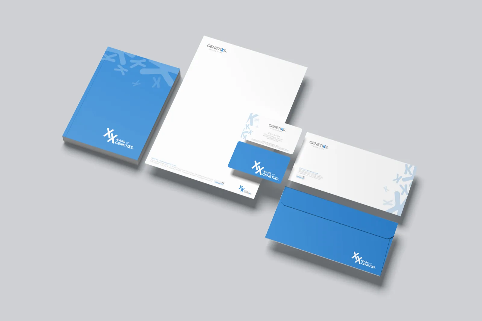
Organic type with rounded corners reflects the fluidity of life. The letter K is drawn to read as an X, a chromosome, so the science sits inside the name itself. Every element followed, from stationery and envelopes to business cards.
in our dna
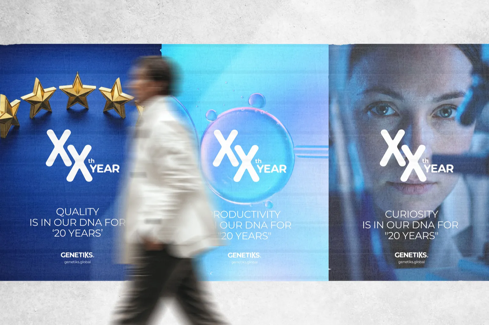
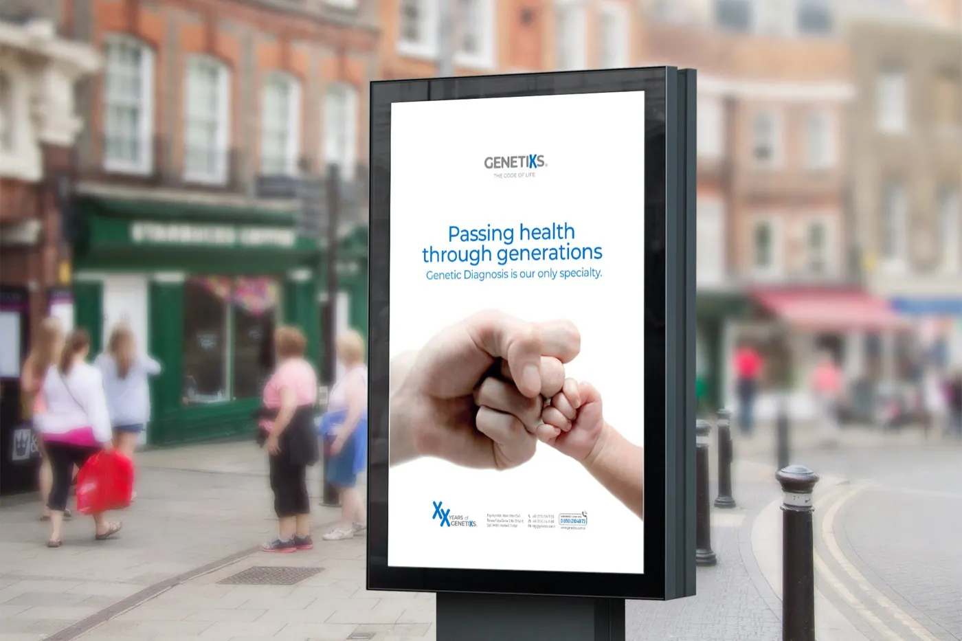
An anniversary campaign of posters on quality, productivity and curiosity, and billboards of a guardian and child bumping fists: health passed through generations.
genetiks club
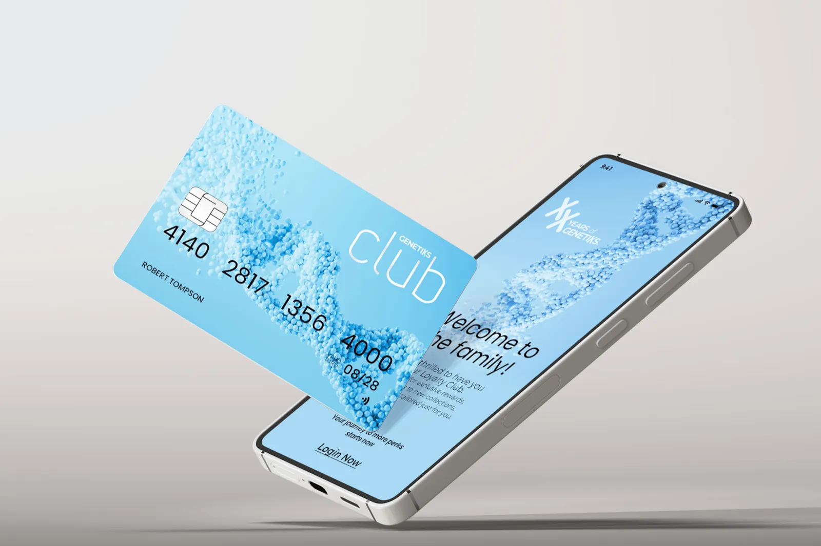
A loyalty membership with a physical card and a mobile app that gives members secure access to their own health data.
spaces
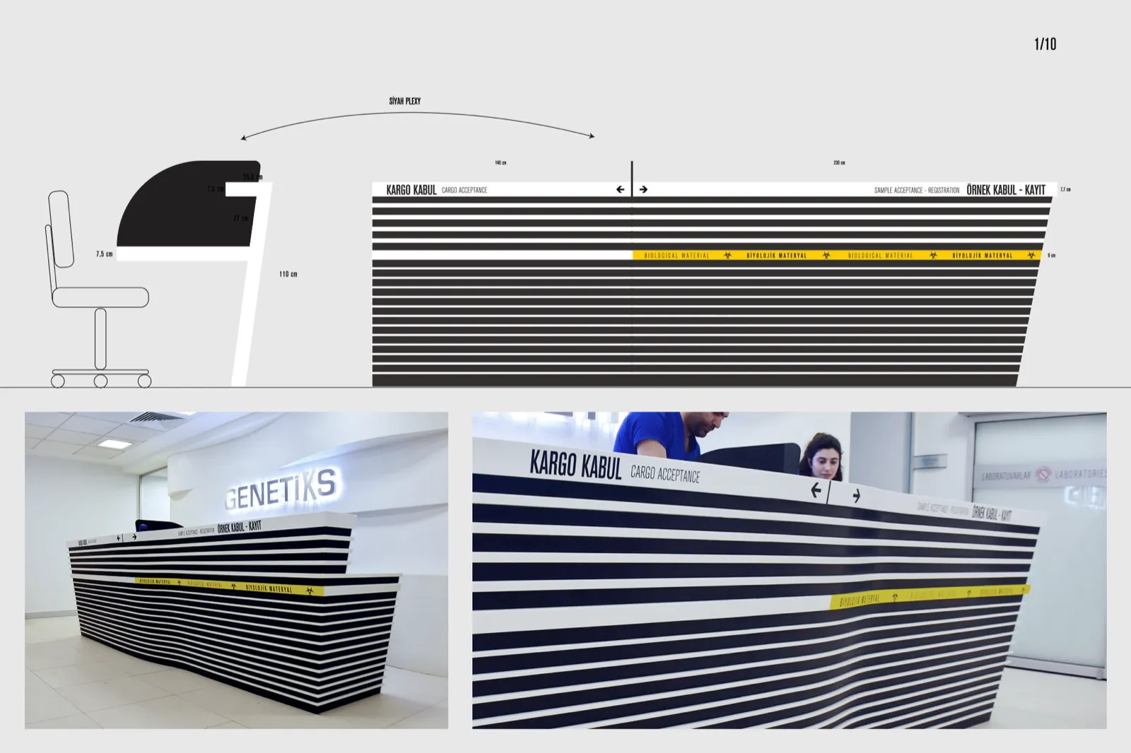
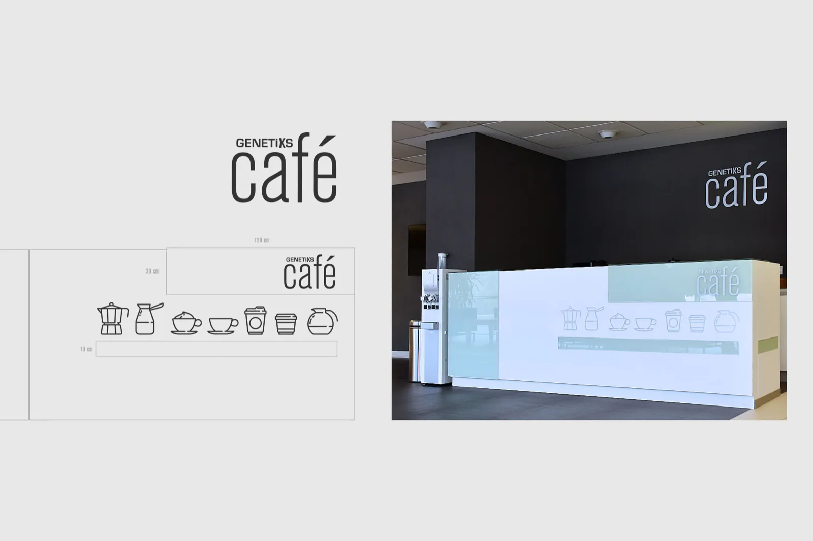
High-contrast graphics for the cargo acceptance and sample registration desks, and a calm visitor café with its own iconography.